

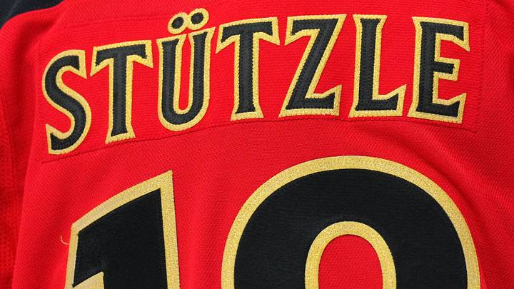
Yesterday, all 32 NHL teams officially unveiled their newest alternative jerseys in the league's Hometown Remix collection. As with most new jersey reveals, fan bases across the league have had mixed reactions to the jerseys, which were curated to pay homage to the team's history and local culture. As for the Ottawa Senators' newest look, most people consider it a ' win' for the Senators, but not everyone is convinced it's the best choice given the team's jersey history.
The jersey features several meaningful details that pay tribute to the team’s heritage. At first glance, the black Fanatics creation resembles the team’s home jersey. The familiar Centurion crest remains on the alternate jersey, but with a more metallic gold finish. The gold replaces the traditional white detailing, giving the crest a more polished look. The same goes for the familiar red stripes and white lettering on the back of the home jersey, which are replaced with gold colouring and red details on this new jersey.
A nod to the Ottawa-Gatineau region
A closer look at the jersey's subtle details reveals several tributes to the team's grassroots in the Ottawa-Gatineau region. One of the most intriguing details is the geometric patterns inspired by the Peace Tower clock on Parliament Hill, embedded in the sleeves.
Historically, the Peace Tower has appeared on many of Ottawa’s jerseys and in promotions. Just before the Senators reentered the league in 1992, promotional jerseys featured the Peace Tower anchored on the front and used to spell the word ‘Ottawa’. Although these jerseys were never used for anything other than promotion, the nod to Parliament Hill was widely appreciated by the fan base and has made subtle returns since then. The logo was then crested with a Maple leaf and used as a shoulder patch in the early 2000s. In last year’s 2025 red alternate jersey release, the peace towers appeared once again in the small inscription of the word ‘Ottawa’.

The shoulder patches on the newest jersey celebrate the team’s bilingual identity with English and French inscriptions over the logo on opposite shoulders. Even the inside hem features an image of the Alexandra Bridge connecting Ottawa and the Québec region of Gatineau.
The subtle details
Some fans online have called the details too subtle, viewing the jersey as a missed opportunity to do more like other teams across the league. With a black jersey and a Centurion logo, some see it as the regular home jersey with more gold accents. Fans were calling for the team to bring back the heritage ‘O’ or the ever-popular Senagoth. Others have criticized the move away from the colour ‘red’ because the black and gold too closely resembles the Vegas Golden Knights’ identity.

Nobody can disagree that the Senators’ Hometown Remix is a true testament to the City of Ottawa. Even the writing pays tribute to the Gothic architecture found throughout the city’s centre. Although some fans may have wanted more, the team chose a more classic, sleek design that reflects Ottawa’s rich history and culture.
The Senators will debut their new Hometown Remix jerseys on November 12 when the Colorado Avalanche visit the Canadian Tire Centre.
 Add us as a preferred source on Google