

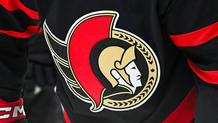
The Ottawa Senators will be celebrating their 35th anniversary in 2027, and over those 35 years, they have had 18 total jerseys in their history. Some jerseys have small iteration changes that didn't merit their own jersey, and others had sizable and recognizable shifts. Some have been great, some good, and, of course, some not so good. So let's rank them from worst to best and see if you agree!
#18 – SENS/SNES

Starting off strong is the black-based jersey with red and white accents, with the name "SENS" across the chest. It seemed like, at the time, the Senators were hopping on the bandwagon of teams that were putting their names in plain letters across the jerseys. For some, it worked, like the Toronto Blue Jays. For others, it didn't, and the "SENS" jersey falls into this category, where some would look at it and read it as if it said "SNES." Although there is something about this jersey that holds a special place for some fans.
#17 – 2007 White 3D

In the same era as the SENS jersey, the Senators moved away from their old branding and completely changed their logo in 2007–08, and it wasn't for the better. The away jersey had a white base with black and red accents. The best part of these jerseys is the original Senators logo patch on the shoulder. The jerseys themselves are just simple and plain and not in a way that helps their look.
#16 – 2017 White 3D

Essentially the same jerseys as the 2007 versions; the difference is they were manufactured by Adidas, who changed the look and style of their hockey jerseys after moving away from Reebok. They also changed the font of the names and numbers on the back, which really comes down to personal preference.
#15 – 2007 Red 3D

The home version of the 2007 jersey really only gets the bump because it has a strong red colour base. The white font and numbers look really clean on these jerseys. Otherwise, it's plain and simple.
#14 – 2017 Red 3D

The 2007 version is only slightly different from this jersey. As mentioned, the style of the adidas jerseys gets the higher spot for me here, but I could happily interchange these because of nostalgia.
#13 – 2022–23 Reverse Retro Jersey (RR)

This is where we start getting into the good jersey territory because this jersey isn't bad. The Reverse Retro line was implemented by the NHL and adidas across the league, with every team getting one. Some teams lucked out and got incredible jerseys, whereas the Senators found themselves in the "not bad" camp. The logo itself is timeless, and the colourway is excellent, but the curved red lines and red arm panels don't do this jersey many favours. On top of that, it wasn't different enough from the Senators' home jersey for it to really feel like a "reverse retro," so fans didn't love it.
#12 – 2017 NHL Centennial Classic Jersey

This is a good jersey, and it could definitely be higher on this list. However, the thing that keeps it from being higher is that the logo is silver. The Senators' brand colours have always been some combination of black, red, and white, with gold used sparingly. This is a nice jersey, and it looks sharp, but it only lands here because of the style points it left on the table by not using gold instead.
#11 – 2025–26 Red Alternate Jersey

Another case of a good jersey being lower on the list because there are a lot of good jerseys to come. This jersey had fans divided this season, with some hating it and some loving it. I think it's a good-looking jersey, but what I appreciated most about it is that it leaned into the gold, which is why it beat out the 2017 Centennial jersey. They introduced a lot of smaller details, with the flairs in the helmet crest and laurels in the black arm band. Where it falters is the black shoulder area, which looks out of place and awkward. If someone wanted to flip this with #12, I'd be okay with that.
#10 – 2021–Present Senators Away Jersey

One of the two jerseys from the Senators' return to their roots features one of the best logos in sports. This jersey looks so good on the ice, and it came at the right time, with Senators fans needing something to cheer about after an abysmal season and the COVID-19 pandemic. The Senators leaned into their roots and hit it out of the park with this jersey. It's a very close replica of the original 1992 jersey, but not quite, and that's why it lands at #10.
#9 – 1992–95 Black Jersey
The jersey the team debuted in was the original black jersey with the red stripes on the arms and around the waist. This jersey is sharp in every sense of the word, and there is an argument for it to be higher, but it has to beat out some really good jerseys. It was simple and plain in a way that worked and caught your eye. Truly iconic.
#8 – 1999 "Senagoth"
Patrick Lalime
— Tendy Gear (@Tendy_Gear) June 30, 2017
Ottawa Senators (2003-2004)
Sherwood 9980 setup pic.twitter.com/eToWDQasP7
The first "true" 3D logo the team had in its history, this red-based jersey had elements that the Senators' 2022 Reverse Retro jersey nodded to with the curved lines and arm design. The thing this jersey does so well is add a different colour within the swooping lines, where the black, red, and white all converge at the Senators logo. This jersey was the 1999–2000 away jersey for the team, and it was a stark change from their white home jersey. It hit all the right notes and reminds fans of the elite teams of yesteryear.
#7 – 1992–2007 White Jersey
The home jersey that started it all. The white-based jersey included all of the colours in the Senators' branding, with the red bands on the arms leading into black down to the wrists and red and black at the waist. It is such a sharp jersey that, if it were still worn today, it would be one of the best in the league. Even up until 1997, these jerseys had "Ottawa Senators" in the logo, which is a nice touch. It should crack the top five but doesn't quite get there.
#6 – 2021 Reverse Retro

When this jersey was announced, it was exactly what fans were hoping for: a red jersey to add to the black-and-white run of the current Senators uniforms. The jersey is the perfect response to making a simple and effective red version of the Senators jersey. It looks so sharp, and they looked great on the ice as well. The Senators deviating from a red-based jersey wasn't a bad idea, but this jersey shows exactly why they should have one.
#5 – 2021–Present Home Jersey

The modern version of the original black Senators jersey is just a bit of an upgrade over its predecessor. The subtle differences this jersey has compared to the original are that the red at the waist extends all the way to the bottom, and the fonts look a bit better to my eye. If someone said they would switch this with the original, I wouldn't fight too hard to disagree.
#4 – 2011–17 Heritage Alternate

This is a jersey that almost every fan can say they own. It is a timeless classic that draws its inspiration from the original Senators jersey from over 100 years earlier. The colours are perfect, with the white on this jersey being more cream-coloured, and the font of the letters is perfect. The shoulder patch featuring the team name in a similarly coloured shield looked clean and classic as well.
#3 – 2000–07 Black "Senagoth"
Boldly finding itself within the top three, this jersey blends nostalgia with eye-catching details. One of the best parts of this jersey is the Peace Tower maple leaf crest on the shoulders, which is still considered one of the coolest symbols the Senators have ever released. The gold band with black laurels and red accent lines is pulled together by one simple white stripe and looks incredible. The "Senagoth" logo itself pops so well on this jersey, with the red outline around the white lettering and, finally, the white around the neck. This jersey is exceptional, and it's one that I could easily put in the top two—or even at number one, for that matter.
#2 – 1995–99 Black Away Jersey

This jersey is the perfect iteration of the black Senators 2D jersey set. Why it beats out all the others is because of how it introduces white into the jersey compared to the other versions. The white in the armband and around the waist ties the jersey together so well. The 1995–97 versions of these jerseys had the "Ottawa Senators" name in the logo, but when it changed to the black laurels, it still looked so good.
#1 – 2014 Heritage Classic Jersey

When introduced, this jersey was immediately a fan favourite. It was simply an alternate to the Senators' often-used black heritage jersey, but what that jersey did well, this jersey perfected. This jersey had subtle nods to the original franchise beyond the obvious, using an almost felt-like material in the logo and in the lettering on the back. Whenever you see someone wearing one at a game, you become jealous because it's a jersey you've always wanted to own. This jersey was only ever worn by the team three times, never to be worn again. It is the definition of special and has earned its place at the top.
Do you agree or disagree with my rankings? How would you rank them? It's not as easy as you'd think when it comes to jerseys you love!
 Add us as a preferred source on Google