

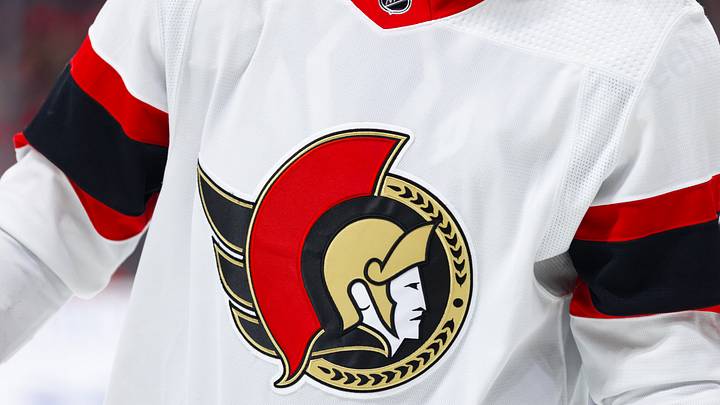
With the recent announcement that each NHL team will be unveiling a new special edition “Hometown Remix” jersey, it is a good time to look back at some of the best and worst Ottawa Senators’ jerseys from their almost thirty-five-year history.
The great debate
For years, the big debate amongst Senators fans has been whether the team should feature a predominantly red or black jersey at home. Ottawa broke back into the league in 1992 with a black home jersey. While making some minor alterations to the colour of the name/number plate and adding a white stripe to break up the red and black, they wore these jerseys until 1999.
It was at this time that the team decided to make their red alternative jersey their home attire. The switch was an interesting choice because not only did it rebrand the home colour, it also helped influence team slogans in the 2000s and 2010s like “United in Red." This change also altered the home logo as well, with the traditional 2-dimensional senator moving to a more 3-dimensional one with a front-facing profile. It was not until 2019 that the team went back to their roots, bringing back not just the black jersey but the original 2-D logo.

Along the way, the organization has introduced a number of alternative jerseys that have come and gone, some paying homage to the original Senators like the heritage “O” logo and others keeping the current home logo at the time and changing up the colour and stripping schemes of the jersey, like the reverse retros of the early 2020s.
For the most part, Senators fans have been spoiled with the jerseys their hometown team has worn over the years. However, there are some that need to be forgotten and never see the light of day again.
The Reebok era
When Reebok acquired the rights to produce the NHL’s uniforms in the early 2000s, it significantly changed not only the material of the jerseys but also their design. Many teams opted for a simpler look, and the Ottawa Senators were no exception. Gone were the multiple stripes from their previous home and away jerseys. The team went with minimal stripping on the sides and bottoms of the sleeves. They also made alterations to “modernize” the 3-D logo and decided to use it on both their home and away jerseys. Prior to this, the Senators had used the 2-D logo on their road jerseys.

The Reebok experiment was a disaster. It prioritized making uniforms that were less busy to help reduce the marginal weight that the players were carrying. Some teams, such as Toronto and Edmonton, did not even put shoulder patches on their jerseys and removed almost every stripe. Though the Senators did not go that far, their rebrand, especially after making it to the Stanley Cup finals for the first time in modern franchise history the year before, was lacklustre to say the least. Their first attempt at a third jersey in the Reebok era was even more disastrous. In 2009, they introduced a black jersey with an underwhelming stripping system while sporting a logo that read “SENS.” The jersey was deeply uncreative and luckily left the team’s jersey rotation after two seasons.
Red, black and gold
While almost every jersey from the Senators' history predominantly features black and red, there are two that include gold within the colour scheme as well. Their alternate jersey from 2000-2007, nicknamed the “Senagoth,” is beautiful not just in its use of gold stripping but also the shoulder patches that feature the parliament buildings. In fact, many fans are hoping the new “Hometown” remix jersey will feature the parliament buildings in some way like this jersey did. The Senagoth jersey does feature the 3-D logo, which might not sit well with some fans, but overall, it is a solid design.

The most recent Sens alternative is the only other jersey that features the gold in its stripping. The 2-D logo is stunning and has fine details that have previously never been included, such as the lines within the red crest. While it would be better if they did something different with the black featured on the top of the jersey, it is a stunning concept that should continue being in the rotation for years to come.
While the heritage jersey collection is appealing, in particular with their stripping, the “O” logo lacks originality. It also opens the door for other fan bases to joke how the Sens’ logo looks like a zero, a number that the team does not want to be associated with if they want to see success in the future.

The team’s current home and away jerseys are nice, but including gold in the stripping would make them pop much more. Perhaps with the inclusion of gold in the alternatives, the team will be influenced to include it on more of their jerseys going forward.
 Add us as a preferred source on Google